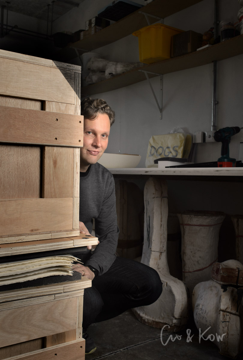
Editorial portrait of David Shrigley, for the Telegraph Magazine
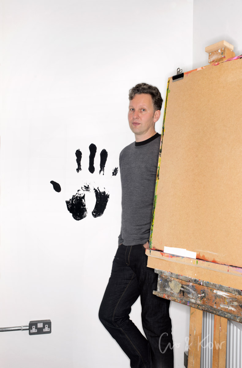
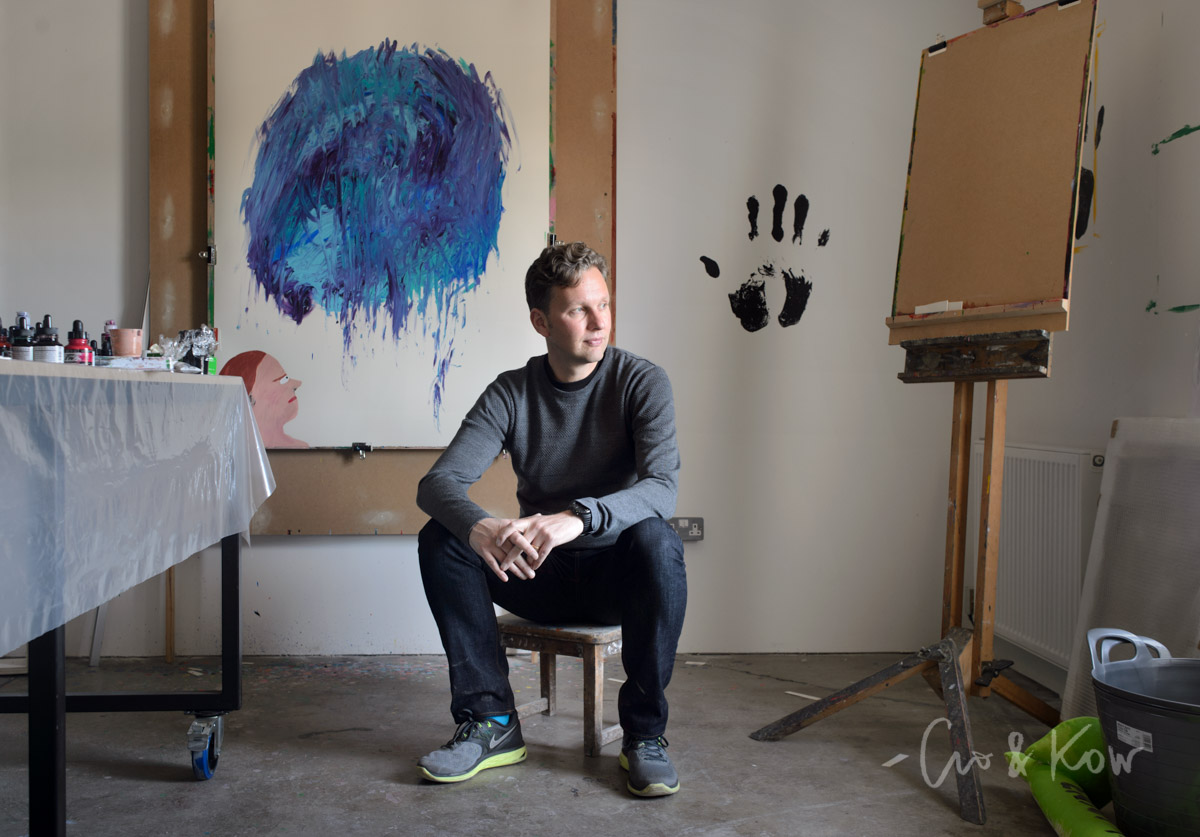
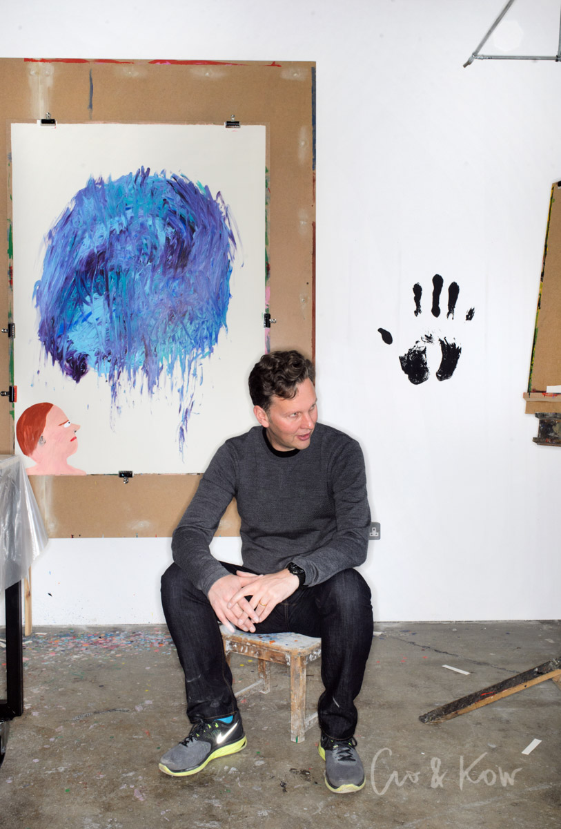
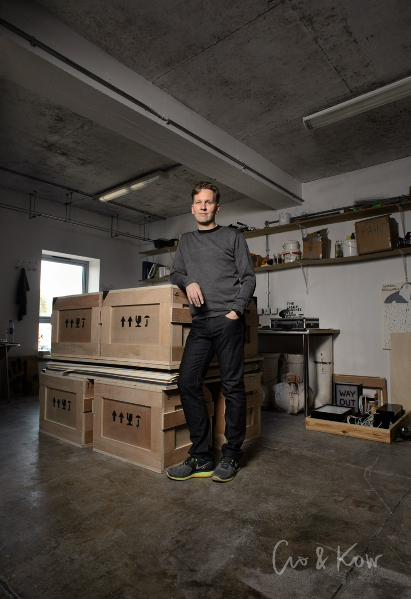
I recently took a portrait of David Shrigley for the Telegraph Magazine. The magazine chose one of our favourite images, and did a great layout out on the page, you can see it here. But while we were there, we tried a few variations in the 20-30 minutes available, and I thought it might be fun for them to see light of day too. The brief had been for a preference for natural light, but when we got there we found there was very little natural light in the studio, so after a few using what natural light there was (one of the first ones of which was the chosen image, so all good there!) we tried lighting one or two in different ways to give some variety and choice. Lighting it always slows things down a bit, which if there is limited time like here means you can try less options in the time available, but in a trick lighting situation can be the difference between getting an effective image and not. In this case, the natural light images worked, but it's good to have some choice.
I'm a sucker for a graphic composition, so I found this first one especially appealing - I think it's the power socket that does it for me!
In the last picture I thought he was standing a bit like Michelangelo's David, so I exclaimed "You look like David!" He looked a bit confused until I remembered that actually he is David. I explained I meant the other one.

